Special Site Paradigm for Elderly Diabetics
Project: CardioCare
Challenge
Design a web site that targets elderly diabetic patients, addressing their unique UX and UI needs.
Comments
The creative brief did not recommend a direction: it only provided sample content and defined the unique needs of the target audience: elderly, poor eyesight, unfamiliar with computers and web browsing, reluctance and difficulty learning new paradigms for consuming information.
Actions
- Conducted online research of the demographic, looked at other websites targeting elderly diabetics
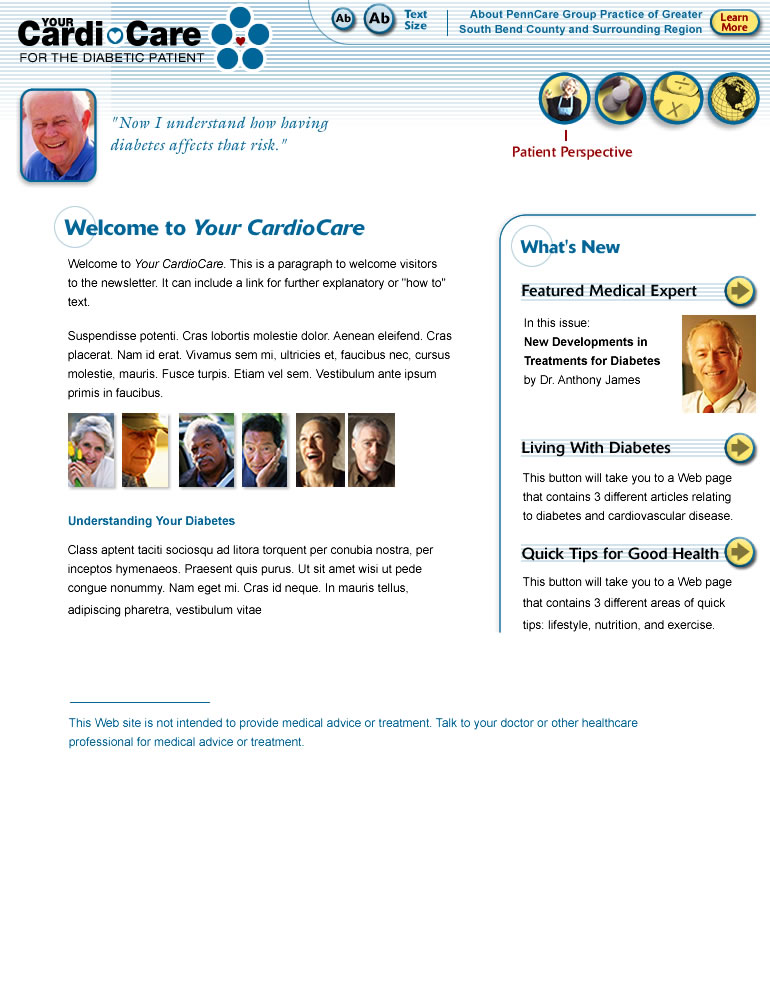
- Recommended a website that mimicked the layout of a printed newsletter, since that would be a familiar paradigm to the target audience
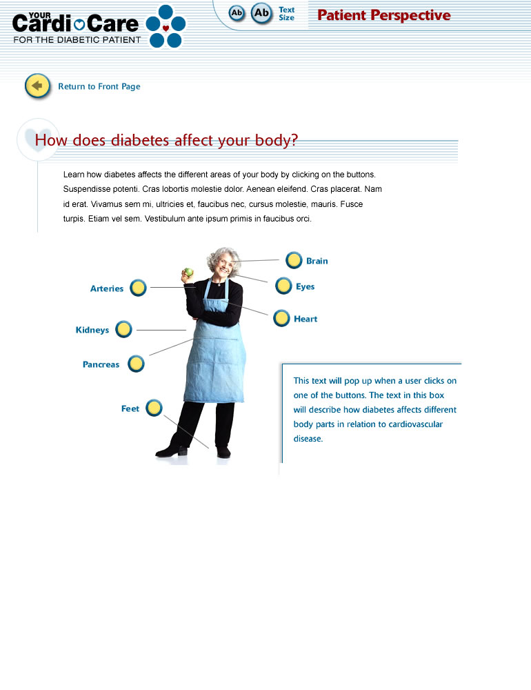
- Navigation available only from the “front page,” and every page had a “return to front page” button — giving users just two things to learn about finding their way around
- No text hyperlinks: just large graphic buttons that were unmistakably “go to” buttons
- Consistent look for anything that is clickable
- CSS-based font-resize gadget displayed prominently on every page, with persistent state of user preferences
- Fluid layouts with handcrafted layout rules at different font-sizes: an early foray into what would later be responsive design, breakpoints and media queries
- Clean, focussed layouts with nothing extraneous on any page
- Bright and colorful for appeal, with just a touch of the pharmaceutical look to instill trust

